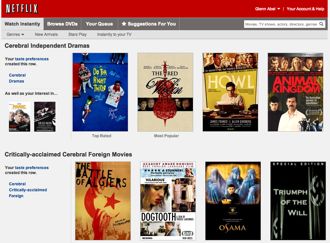
 Netflix’s Watch Instantly customers are seeing a new landing page, one with bigger images, more titles on display and smoother functionality. Predictably, a lot of them don’t like it.
The old design — horsey by any measure — is still around in spirit. Users continue use the familiar rows of DVD box art to navigate titles, but there are more rows and more choices in each row. All in all, navigating the streaming media page is more of a pleasure than it was yesterday (a minority opinion).
The design recalls the changes made to the Xbox Live interface for Netflix a month or so back. One of the biggest changes is the addition of more specific personalized subcategories — such as “Dark French Thrillers” and the classic “Critically-acclaimed Understated Documentaries.”
The scrolling process feels much better, with a smooth JavaScript flow that some users find too slow. The category rows repeat their title images in a loop, apparently endlessly, as long as the mouse moves to the left or right of the rows. With the old design, you had to click on arrows to see each panel display of the titles.
People hate most changes to their comfy everyday web pages*, and the Netflix crowd is no exception, based on the more than 1,700 so comments on the Netflix corporate blog:
“This is the most terrible change I’ve seen,” one guy howled. “Are you guys smoking crack over there?”
Netflix blogged that the overhaul “provides more focus on the TV shows and movies streaming from Netflix.” At least there are more of them in view.
The Netflix redesign added a red play button that appears over a title’s image, activated by holding the cursor over the image. That initiates the video stream to users’ computers or wireless devices. The play button appears just before the more-or-less familiar pop-up box.
That box has to be summoned in order to see the name of the movie or TV show and its starred review ratings. The previous DVD/Instant Queue options on the title image have disappeared, and forget sorting by ratings or date of addition.
“Why should I be forced to click through 27 pages of listings and hover over every one of them to see the ratings?” one user griped. Another called the change a “horrible implementation of a bad idea.”
Feeling nostalgic? The old interface scheme remains on the “Discs” side of the site, which displays all Netflix titles in the format that everyone seems to miss so much.
The “Watch It Again” row continues to waste space, unfortunately.
A commenter on Hacking Netflix says he had a talk with a customer service rep who’d heard it all Thursday. “Apparently a major complaint is “the seasick effect” from having all of the side scrolling, but done in an uncontrolled way,” the commenter, Richard Huffman, reports.
Meanwhile, Thursday saw renewed speculation that cash-hording Microsoft would make a play for Netflix, which is publicly traded. The spark came from a Fortune contributor who predicted that “buying Netflix and installing (Netflix’s Reed) Hastings as co-CEO would position Microsoft to return to the center of the tech industry.”
And Miramax titles continue to straggle in for Netflix streaming. Hulu Plus did a major drop of the Miramax titles on day 1.
* Motley Fool’s Anders Bylund observes: “As we’ve seen every time Facebook or Twitter revamps its landing pages, or Yahoo! updates its monstrously popular Yahoo! Mail, disgruntled users come out en masse to complain about it.” Of course, and when the redesign is replaced down the road, the same folks will complain about that change. Which is not to say that some of the criticisms of the Netflix streaming page aren’t valid.
What do you think of the Netflix redesign?


If Netflix had simply switched things around and added a couple of new features, then the voices over the controversy would quickly fade away. However what Netflix has done is decided to remove key features such as Sortable Lists. Netflix has decided in its wisdom that browsing by DVD cover and a keyword search are enough for users, and now users are saying in their wisdom that they’ve had enough of Netflix.
This article takes the tone that the people who don’t like the design are some small radical sect. Take a look at Netflix’ blog now. The redesign maxed out its 5000 comments, 98% negative. People are commenting on unrelated blog posts ‘just to be heard’. Web usability specialists like me are googling things like “netflix redesign” to find pages like this.
The “seasick” effect is real. I have never had a web page do this to me, but it makes me physically nauseous. Sounds funny, but it’s true.
This redesign screams ‘lack of user testing’ – it is almost inconceivable how it was thought to be better.
Darius: Thanks for weighing in. As for the small radical sect, I did write that mine is a minority opinion. I’ve learned over the years that most people dislike redesigns of anything they use on a regular basis. In this case, I prefer the new one, which is not to say I think it’s all that hot. Netflix clings to its old clunky web design scheme and it pretty much stinks. (Also, I’m a bad person to ask since I review DVDs and know the covers on sight.)